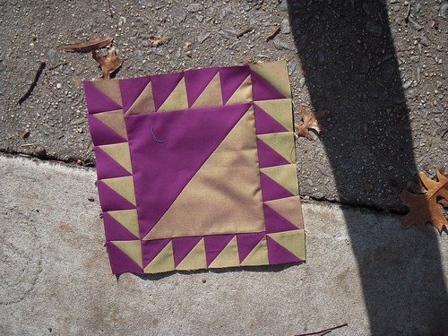
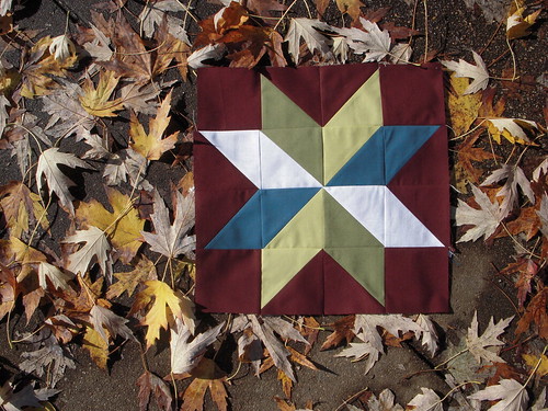
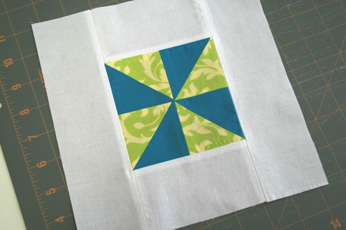
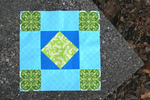
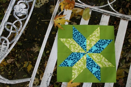
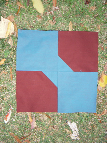
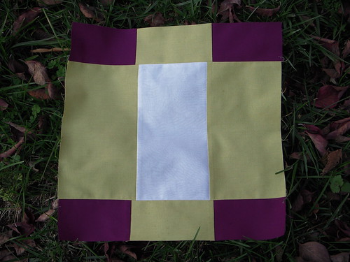
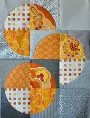
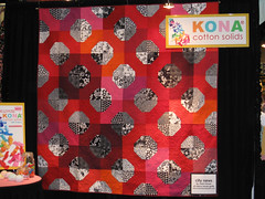
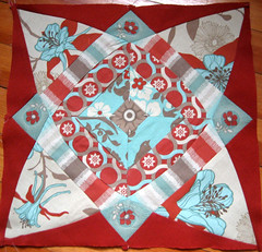
Lady of the Lake has a beautiful name but is kind of a pain to make. If you're worried about your half-square triangles coming out perfect, bump measurements up to an even 3" and 9" then trim after sewing and pressing.
Monday, November 30, 2009
Lady of the Lake
Contrast is key with the Lady of the Lake block. Since the center blocks are so big, choose fabrics that you would like to showcase. Here's a great resource on making Lady of the Lake and, of course, some inspiration
Lady of the Lake has a beautiful name but is kind of a pain to make. If you're worried about your half-square triangles coming out perfect, bump measurements up to an even 3" and 9" then trim after sewing and pressing.
Lady of the Lake has a beautiful name but is kind of a pain to make. If you're worried about your half-square triangles coming out perfect, bump measurements up to an even 3" and 9" then trim after sewing and pressing.
Labels:
jennifer,
lady of the lake,
quiltalong round 1,
tutorial
Antique Tile
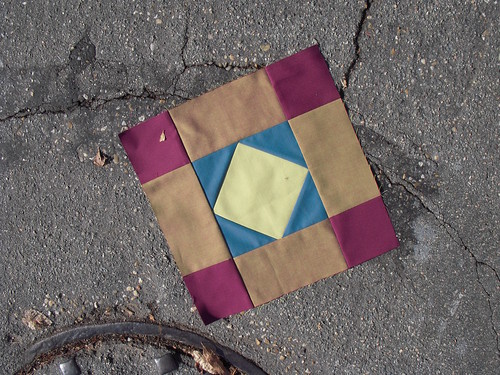
Here's my version of the Antique Tile block. It's gorgeous. I've definitely underused the red/green shot cotton in my other blocks. I'm considering going back to redo some blocks with different fabric choices.
Friday, November 27, 2009
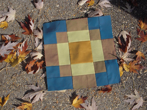
Antique Tile
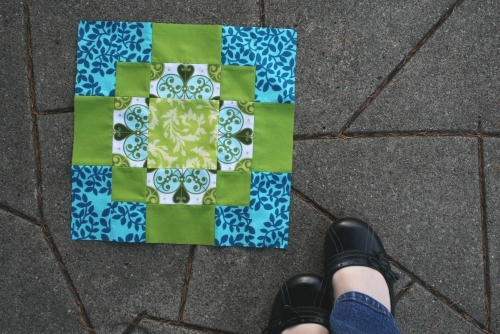
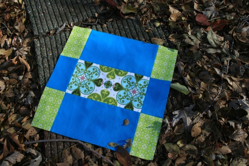
This is one of my favorite blocks so far and in general. This is a great block for directional prints since there aren't any triangles to mess it up.
This tutorial will show you the fastest way to make this block using strips of fabric. You also have the option to cut individual pieces if you're trying to manipulate the direction of the print. This is a fun block and I can't wait to see what you come up with!
Labels:
antique tile,
crystal,
quiltalong round 1,
tutorial
Wednesday, November 25, 2009
Courthouse Steps
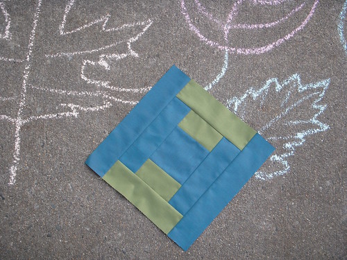
This block is a Log Cabin variation. It's very simple and intuitive to put together. I, of course, think it is modern in its simplicity. We'll see if you agree!

Labels:
courthouse steps,
jennifer,
quiltalong round 1,
tutorial
Tuesday, November 24, 2009
Flying Dutchman
Monday, November 23, 2009
Amish Diamond
Dutchman's Puzzle
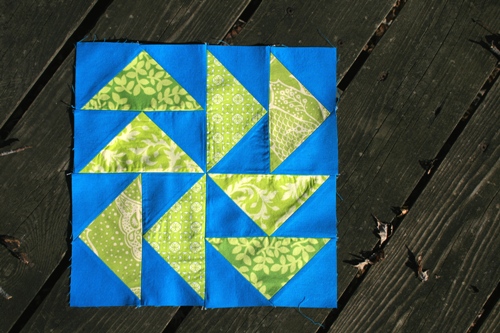
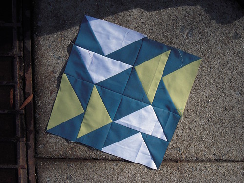
Dutchman's Puzzle blocks are really fun because there are lots of variations. Basically, we're making eight flying geese blocks and then sewing them together. This tutorial uses four fabrics plus a background fabric. You could use from one to eight fabrics plus a background fabric (or many background fabrics). It's up to you.
There is also more than one way to make a flying geese block. My tutorial will leave you with lots of leftover triangles. I like this method because it makes an accurate "goose" and I can make four bonus pinwheel blocks from the leftover pieces.
If you want to make these blocks without the "wasted" fabric, try this tutorial. I've never made flying geese this way it so I don't know how well it works...it looks pretty cool, though and I'd like to give it a try someday.
Labels:
crystal,
dutchmans puzzle,
quiltalong round 1,
tutorial
Sunday, November 22, 2009
Churn Dash
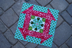
Churn Dash
Originally uploaded by blueberrymoon
Look at this gorgeous thing! I know many of you don't like the Churn Dash, but this version only further solidifies my love for this block.
Thursday, November 19, 2009
Starflower Block
Ohio Star
The Ohio Star block is probably one of the most common and well-known traditional quilt blocks. You can find many variations, including the Maverick Star, which is currently all the rage around the internets.
This block is easy to make, so long as you pay attention to the details. It's built on a simple nine-patch block, with quarter-square triangles thrown in.
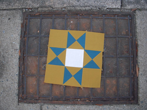
This block is easy to make, so long as you pay attention to the details. It's built on a simple nine-patch block, with quarter-square triangles thrown in.

Labels:
jennifer,
ohio star,
quiltalong round 1,
tutorial
Amish Diamond
Oh my gosh, check out Lisa's new Amish Diamond Block:
I LOVE how she used fussy cutting and directional prints to take this block to a new level! I also can't get enough of those colors! Lisa is working out 6" versions of these blocks which makes them truly tiny! I love truly tiny things!
It looks like almost everyone is keeping up with our rapid quilt-along pace. I'm so excited about that and Jen and I are really, really happy that you guys are quilting along with us. It's so nice to have a group of people who can keep each other going, keep each other inspired to make the next awesome block. Thank you for joining us in this experiment!
Also, in case you were wondering: our block tutorials will finish up in early December which means that ambitious quilters can have a finished quilt by the holidays or end of the year. I'm looking forward to spending some snowy evenings binding my quilt. It's my favorite part about quilting!
What's your favorite part of the quilting process?
Wednesday, November 18, 2009
Bonus (mini) Block!
Tuesday, November 17, 2009
Churn Dash
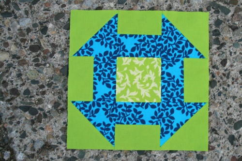
I enjoyed making this block but there's something about the Churn Dash that bothers me...too pointy, I think? I mean, those triangles hanging over the edges...my eyes feel like they're going to be poked out! But I've seen some that I do like so I don't know what my problem is.
I like this churn dash with fish and this one that mixes up the fabric placement. This block is great because of the fussy cutting and tree(!) fabric and this one is my favorite because the design blends with the background.
How do you feel about churn dash blocks? Do you like quilts made up of only this block?
Monday, November 16, 2009
Churn Dash
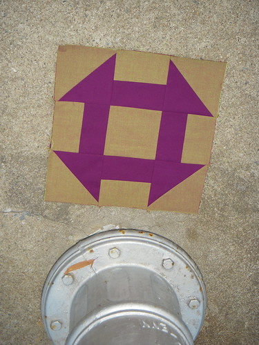
I first saw the Churn Dash block as a tiny thumbnail picture in the novel Alias Grace by Margaret Atwood. The block seemed especially simple and traditional then, and I still feel that way today. Like the Bow Tie block, the Churn Dash has subtle elegance. This block can have many personalities, depending on which fabrics you choose.

Labels:
churn dash,
jennifer,
quiltalong round 1,
tutorial
Friday, November 13, 2009
Thursday, November 12, 2009
Bow Tie Variations
Feeling lonely without a modern border on your Bow Tie block?
No worries. Follow the steps in our Bow Tie Block tutorial using these specifications. At the end, just add your borders!
Fabric A (bow tie): cut two 5.5" x 5.5", cut two 2" x 2"
Fabric B (background): cut two 5.5" x 5.5"
Fabric C (border): cut two 1.5" x 12.5", cut two 1.5" x 10.5"

Or, you could create a block made of four smaller bowties, just like this one. Follow the same steps in the Bow Tie block tutorial using these cutting instructions.
Fabric A (bow tie): cut eight 3.5" x 3.5"
Fabric B (background): cut eight 3.5" x 3.5", cut eight 1.5" x 1.5"
No worries. Follow the steps in our Bow Tie Block tutorial using these specifications. At the end, just add your borders!
Fabric A (bow tie): cut two 5.5" x 5.5", cut two 2" x 2"
Fabric B (background): cut two 5.5" x 5.5"
Fabric C (border): cut two 1.5" x 12.5", cut two 1.5" x 10.5"

Or, you could create a block made of four smaller bowties, just like this one. Follow the same steps in the Bow Tie block tutorial using these cutting instructions.
Fabric A (bow tie): cut eight 3.5" x 3.5"
Fabric B (background): cut eight 3.5" x 3.5", cut eight 1.5" x 1.5"
Labels:
bow tie,
jennifer,
quiltalong round 1,
tutorial,
variation
Nesting Seams
Remember what I was talking about in the Nine Patch tutorial about matching up the seams?
Apparently it's called "nesting seams"-- who knew? Here's a great video that shows exactly what I meant.
Apparently it's called "nesting seams"-- who knew? Here's a great video that shows exactly what I meant.
Bow Tie
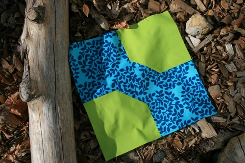
So, bow tie blocks. I'm not really a fan but I think it's because it's not a symmetrical block...not in the way a nine patch is, you know? Diagonal? Freaks me out! I wish I had some striped fabric to use for this block...that might have been cool. I still like how it turned out, though.
I've been searching for inspirational bow tie quilt pictures and haven't found any (except for the City News quilt I posted about the other day). If there's a bow tie quilt or block that you find inspiring, feel free to post a link in the comments. I'd really love to change my mind about bow ties.
Tuesday, November 10, 2009
Bow Tie Block
What's Modern: No Negative Space
We talked about the use of negative space in quilts but I think it's also important to talk about non negative space. I know some people are nervous about using "too much print" in their blocks but I don't think there's anything to fear. The key is to use value or color to give the eye a place to rest.
These quilts, while busy, feature contrasting values (light and dark) in order to make the design pop. The eye is drawn to the dark fabrics which are restful amidst the chaos.
These quilts use fabrics that are all a similar value. The lack of contrast makes these quilts feel calm (even though they're very bright).
And these quilts use color to give the eye a place to rest.
What do you think? Do you like the all pattern, no solids look of these quilts? Do you find they're too busy, too chaotic?
Monday, November 9, 2009
Color Quandary
When I started brainstorming this project everything fell together so easily-- except color. I had a color crisis.
I normally buy bright fabrics, but then get too scared to use them. Not to mention my inspiration for this project was all over the place. I kept seeing gorgeous photos with wonderful, muted, contrasting colors. This nautilus sculpture was amazing me, as well as the browns of these deer against a green-blue fence. This photo had just the right muted tone, and this one was calm, just as I'd envisioned my quilt.
So, you see my color quandary.
Instead of focusing on color, I ended up choosing my fabrics based on texture. I decided to work with a couple of shot cottons as well as some plain solids. Fabric texture and feel can have quite an effect on how a quilt looks. This quilt with blender batiks has a faux texture because of the dye pattern on the fabrics. The colors are muted, but have an interesting visual quality because of how they were dyed. Shot cottons, seen here, can create a whole new look with solid fabrics because of their iridescent quality. When viewed one way, they're one color-- the other, another color. They're especially interesting when paired with black. They definitely add visual interest and subtle contrast when added to a quilt.
Pinwheel Party
I got pretty inspired by Jen's pinwheel (see this post), and decided to freestyle off of Crystal's tutorial a little bit. The results are exciting!
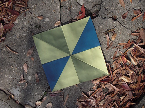

Another pinwheel!
Can you believe it, Jen already finished her pinwheel block for the quilt along!
I just had to post this because I think it's a great pinwheel with great contrast. And also because Jen's fabric, to start, was only 4.5" wide. She pieced each square before making her triangles . It took her three hours to make this block but I think (and I hope she thinks) it was well worth it. Those pink stripes totally make this block for me.
I can't wait to see what everyone else comes up with!
Saturday, November 7, 2009
Skinny Nine Patch
Friday, November 6, 2009
Nine Patch Inspiration
Originally uploaded by abxkris
Look at this awesome Nine Patch block created by abxkris. She posted it to our Modify Tradition Flickr pool.
I feel like a proud grandmother. Grandmother because I'm the mommy of this project (well, one of the mommies, how modern), and this is the baby of one of our babies. Get it?
Okay. Sorry. Back to the block.
I love the polka dot prints! The dark streak in the middle draws my eyes across the block and makes the light dotted print shine.
Great job and keep them coming!
Good News!
Figured we'd better let you know about our Flickr group.
Please join the group and post your completed blocks. Ours are there, and we can't wait to see what you come up with!
Please join the group and post your completed blocks. Ours are there, and we can't wait to see what you come up with!
What's Modern: Lots of White and Neutrals
Jen already talked about using lots of white in quilts but I wanted to explore that idea a little further. The use of neutrals seems very modern but it's actually very traditional. For example, Double Wedding Ring and Irish Chain quilts have historically been set on fields of white.
Pairing a color with a neutral (especially a contrasting neutral) will usually get great results. For instance, take a look at this beautiful orange and gray block from cutter007:
Isn't it stunning? Every time I see it in my flickr favorites I'm stunned anew! Neutrals, even though usually in the background, have the power to propel a design to new heights.
Here are two more examples of gray in quilts.
And, of course, more white.
Lately I've really been into tan in quilts.
And we can't forget about black.
So, what do you think? Why are neutrals so "modern" now, even though they've been used in traditional quilting since the beginning? What's your favorite neutral to use in quilts?
So far I've only tried white. But I just got some nice Kona solids in tan and gray and I'm excited to give them a try.
Nine Patch
Here's my take on Jennifer's nine-patch:
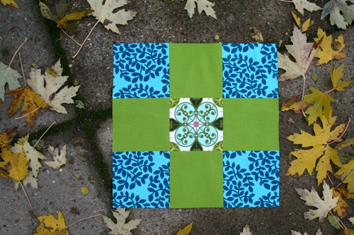
I know most of you have made a nine patch before but Jen and I wanted to get back to the basics of quilting, to start with the easy blocks and move towards more complicated blocks.
I love the nine patch because it's simple to construct but it doesn't have to look simple once it's done. I love a fussy cut square in the center or the corners. Directional fabrics would change the look of this block as well as the arrangement of lights and darks. It's a fun challenge to think outside the box on this traditional block.
Nine Patch
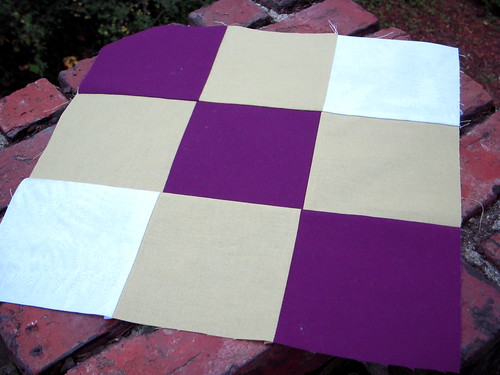
Can you believe this is the first Nine Patch block I have ever made? Now is your chance to stop neglecting this classic quilt block!

Labels:
jennifer,
nine patch,
quiltalong round 1,
tutorial
Thursday, November 5, 2009
What's Modern: Solid Fabrics
Now that we've talked about prints, let's talk about solids. To many people, solids are the very definition of modern. Solids are sleek and streamlined, bold yet subtle.
On the other hand, solid fabrics have been used in quilts since the beginning of quilting. They give the eye a place to rest and provide a great canvas to show off quilting designs.
You've all probably seen Cherri's quilt: City News.
Cherri's use of solids make this traditional quilt (do you see the bow ties?) feel very modern. The red/pink/orange is stunning and the black and white prints really enhance the modern feel.
It's also been a recent trend to make quilts out of only solids. The Amish have been doing it since the late 1800's, though...so all good ideas come around eventually. Check out some of my favorite quilts made of all solid fabrics.
I have a few more fabric ideas to share tomorrow but in the meantime, do you use solid fabrics in your quilts? Do you use only solid fabrics in your quilts? Do they feel modern to you?
What's Modern: Creative Use of Prints
The first "modern" idea I want to talk about is creative use of prints. Fussy cutting has been around forever but has seen a comeback in the modern quilt movement. I've seen a few traditional blocks make use of fussy cutting but I'd really love to see more. Also, keeping track of and manipulating directional prints can be a great way to add drama and movement to a block.
Check out this block that Julie made:
Stunning, right? Julie says it took her three hours to make but that it was worth it. I agree!
The pattern of the block itself is interesting but what really catches my attention is the way Julie used her fabric within the block. The fussy cut corners really tie everything together and the stripes and serpentine print keep the eye moving.
Here are a few more blocks that highlight fussy cutting and directional prints.
I love this block because the fabric and the block layout meld together in such a natural way.
And check out this gorgeous patchwork pillow. The depth created by the directional fabric is fantastic.
To me, traditional blocks often feel rigid and cold. They don't seem to have as much personality as today's improvised quilt blocks. But by making the most of your fabric, a traditional block can have character and a unique personality while still feeling orderly and tidy, while still staying true to its roots.
What do you think? Do you like to use directional prints/fussy cutting in your blocks? Feel free to link to a photo so we can all see.
Wednesday, November 4, 2009
What's Modern: Fabric and Design
So, yesterday I said that all colors have the potential to be modern. Now I'm going to say that not all colors will look modern in all quilt layouts.
For instance, here's a sampler quilt done in pink and brown. I think this looks very "traditional". But what about this quilt? Modern, right?
Colors can be both traditional and modern...the way we feel about them is determined by the fabric choices and the block design/quilt layout.
Modern layouts have the advantage. So long as the design looks modern to the eye, it's easier to accept the color choices. Traditional quilts have unfortunate accociations that tend to get in the way. It's very hard for modern eyes to see a traditional quilt and think "whoa, now that's modern!"
This is the challenge Jennifer and I (and hopefully you!) want to take on with this project.
Deciding what's modern is complicated and there's no right answer. However, Jennifer and I have noticed a few trends that we feel are very modern and that might help us turn our traditional blocks into a modern quilt.
I'll post the first this afternoon. Until then, I'd love to hear everyone's opinion on this complicated question. What's modern to you?
Fabric Requirements
If you're quilting along with us, I bet you're wondering how much fabric you'll need. Our plan is to show you how to make at least 14 blocks (plus a few bonus blocks along the way).
When picking fabrics, a good thing to keep in mind is contrast: these blocks look great when you pair a lighter fabric with a darker fabric. Medium tones feel very safe but add some lights and darks and see what you think.
If you want to make all of these blocks, you'll need about 2.5 yards of fabric. This is only for the blocks themselves, not for sashing, binding or backing. All of the blocks can be created using only two fabrics but most look better when you use more than two. Jennifer's favorite LQS quilt lady suggested she use six different fabrics.
The more fabrics you have, the less of each you'll need. If you're afraid of making mistakes or if you think you'll use one fabric more than the others, be sure to have some extra.
Also, keep in mind that you might want to use some of your block fabric on the back of your quilt or for binding or something. This quilt-along is more of a "do what you feel" sort of thing which makes estimating fabric more difficult. I'm using fabric that I know I can re-order if necessary but I also have a good idea of what I want my quilt to look like and how big it'll be. That makes estimating much easier.
Jennifer has already started posting pictures of modern quilt layouts and we'll continue that in hopes one inspires you. And if you have any questions about your ideas or fabric requirements, feel free to comment or send us an email.
modifytradition (at) gmail (dot) com
Tuesday, November 3, 2009
What's Modern Part 2
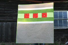
modern munki munki martian quilt back
Originally uploaded by filminthefridge
Many quilters today are creating quilts with pieced backs. Those backs alone are works of art, and many times I find them to be more appealing than the front of the quilts!
Most of these pieced backs exhibit an irregular use of space. I definitely file this in the "modern" category, simply because it's different and completely not traditional. The off-kilter placement of the patchwork lends a crisp, geometric feeling, much like these quilts I found on google.
Check out these other examples of quilts that use space in an innovative or irregular way.
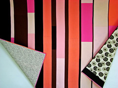
pink stripe edges flipped SM
Originally uploaded by ralexandra

Jaffa Cake Quilt - the Back
Originally uploaded by Red Pepper Quilts
What's Modern: Color
I spend a lot of time thinking about quilts but more specifically, I think about color. Color gives life to a quilt, gives it the power to affect our emotions, to draw out memories.
When picking colors for your modern-traditional quilt, it's important to think about how you want the quilt to feel. What colors feel "modern" to you? Is modern cold, machine-like? Is it bright and sassy? Is it subtle and subdued? I don't want to sound like I'm taking the easy way out but I really do feel that every color can feel modern...it's all in how you use it.
When thinking about modern colors, I don't let what's "hot" right now influence me. Colors have been paired up for centuries. For example, I love yellow, orange and green mixed together.
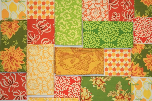
But remember when harvest gold, burnt orange and avocado were all the rage? Same colors, different names. Don't let "dated" color combinations scare you off and if you don't like what's "popular" right now, don't worry about it. Choose colors you love and you'll be happy.
More ideas below the cut.
When picking colors for your modern-traditional quilt, it's important to think about how you want the quilt to feel. What colors feel "modern" to you? Is modern cold, machine-like? Is it bright and sassy? Is it subtle and subdued? I don't want to sound like I'm taking the easy way out but I really do feel that every color can feel modern...it's all in how you use it.
When thinking about modern colors, I don't let what's "hot" right now influence me. Colors have been paired up for centuries. For example, I love yellow, orange and green mixed together.

But remember when harvest gold, burnt orange and avocado were all the rage? Same colors, different names. Don't let "dated" color combinations scare you off and if you don't like what's "popular" right now, don't worry about it. Choose colors you love and you'll be happy.
More ideas below the cut.
Monday, November 2, 2009
Up to the Challenge?
Hello! My name is Crystal and I normally blog my sewing misadventures over at Sonnet of the Moon.
Aesthetically I’m drawn to today’s modern quilts. Lots of white, colors that pop, improvisational, wonky. When I flip through pictures of quilts, the bam, in your face modern quilts are always my favorites.
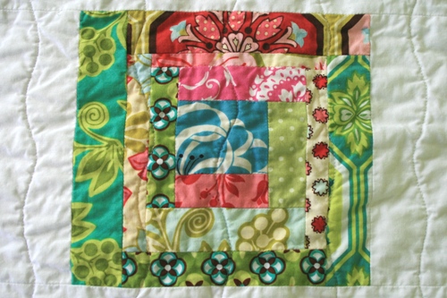
Emotionally, though, I’m drawn to traditional quilts. I like to think about the people who made them, why they made them, who they made them for. I imagine women swapping ideas for blocks, trading scraps of fabric, sewing by hand, by candlelight. I think of the rich history, the memories in each scrap of fabric. Who was the first person to create a nine-patch? A log cabin? Who first thought hexagons were worth all that trouble? Were they as obsessed with them as I am?

Unfortunately, as much as I love the idea of traditional quilt blocks, I don’t like them very much. Modern quilts are so fresh and fun, traditional quilts are bland and boring.
At least that’s what I thought when Jen approached me with her idea for this project. I was pretty convinced that there was no way to make traditional quilt blocks modern or interesting.
But then the rebellious side of my personality kicked in. Surely there must be a way to give traditional blocks some modern appeal. There has to be a way to make a sampler quilt look good. There has to be a way to modify tradition without changing it beyond recognition.
So that’s the challenge I set for myself and that’s my goal in this project. I look forward to thinking about the history of quilting while making my traditional blocks. I look forward to picking bright, beautiful fabrics to compliment the block designs. I look forward to making a sampler quilt I don’t hate.
Maybe I can do all this and maybe I can’t…but at least I’m going to try. Hopefully you’ll want to give it a try too.
Aesthetically I’m drawn to today’s modern quilts. Lots of white, colors that pop, improvisational, wonky. When I flip through pictures of quilts, the bam, in your face modern quilts are always my favorites.

Emotionally, though, I’m drawn to traditional quilts. I like to think about the people who made them, why they made them, who they made them for. I imagine women swapping ideas for blocks, trading scraps of fabric, sewing by hand, by candlelight. I think of the rich history, the memories in each scrap of fabric. Who was the first person to create a nine-patch? A log cabin? Who first thought hexagons were worth all that trouble? Were they as obsessed with them as I am?

Unfortunately, as much as I love the idea of traditional quilt blocks, I don’t like them very much. Modern quilts are so fresh and fun, traditional quilts are bland and boring.
At least that’s what I thought when Jen approached me with her idea for this project. I was pretty convinced that there was no way to make traditional quilt blocks modern or interesting.
But then the rebellious side of my personality kicked in. Surely there must be a way to give traditional blocks some modern appeal. There has to be a way to make a sampler quilt look good. There has to be a way to modify tradition without changing it beyond recognition.
So that’s the challenge I set for myself and that’s my goal in this project. I look forward to thinking about the history of quilting while making my traditional blocks. I look forward to picking bright, beautiful fabrics to compliment the block designs. I look forward to making a sampler quilt I don’t hate.
Maybe I can do all this and maybe I can’t…but at least I’m going to try. Hopefully you’ll want to give it a try too.
Sunday, November 1, 2009
What's Modern Part 1

Mini Patchwork Quilt
Originally uploaded by BooDilly's
Millie had it right when she sang that "everything today is thoroughly modern." Most quilts that I see exhibit modern characteristics.
One quality I consider modern is use of white space. Modern quilts, like modern page layouts, use white space (though not necessarily white fabric) to their advantage.
This modern Nine Patch quilt alternates blank white space with a printed fabric that includes a lot of white space. This technique gives the quilt a crisp, minimalist feeling. A quilt alternating two small scale prints with little white space wouldn't feel nearly as up to date.
Tradition
Quilting is an age-old traditional craft. Quilts have long been seen as necessary, functional items, as well as works of handmade art. Participating in this craft, in whatever form, connects us to history, ancestors, and tradition.
Lately, though, it seems that contemporary quilters have moved away from traditional forms. This is a shame to me, because traditional quilt blocks are what first interested me in the craft. I love the sense of geometry and order that traditional quilts present. The calculated angles and symmetry appeal to me. At the same time, I love the look of modern quilts. Their irregular sense of space and inventive use of shape and color intrigue me.
This project idea was born out of my appreciation for both traditional and modern quilts. I wanted to marry my love for the traditional with the form and method of the modern. In this blog, Crystal and I will attempt to modify tradition-- that is, we'll each be using traditional patterns to create a modern quilt.
Interested in the experiment? Sew with us! We'll be posting tutorials for two different blocks each week, as well as discussing modern color and layout choice.
This ain't your grandmother's quilt sampler!
Subscribe to:
Comments (Atom)
